Are you experiencing a Heavy CLS issue for your header or mobile menu on your Genesis Theme?
Below are the CSS codes that you can try to fix your Genesis theme based on their variants of the child theme.
Application: Insert it to Custom CSS inside Appearance >> Customize >> Additional CSS
Currently working with all child-themes
@media only screen and (max-width: 768px){
#genesis-nav-primary {
	display: none;
}
}
OR
@media only screen and (max-width: 960px){
nav#genesis-nav-primary{
    display: none;
}}
Child Theme Variant
eleven40 Pro – Genesis Child Theme
Working CSS values for it are in the below box (if the above doesn’t work for Eleven40 Pro)
@media only screen and (max-width: 960px){
.genesis-nav-menu{
    display: none;
}}
Authority PRO – Genesis Child Theme
Working CSS values for it are in the below box (if the above doesn’t work for Eleven40 Pro)
@media only screen and (max-width: 960px){
nav#genesis-nav-primary{
    display: none;
}

.hero-section.has-columns .hero-section-column.left {
	top: 212.531px!important;
}}
The Above code will also fix the CLS issue on the homepage for the Authority PRO theme.
Alternative (Older theme versions)
@media only screen and (max-width: 768px) {
.genesis-nav-menu ul {
display:none;
}
}
OR
@media only screen and (max-width: 768px) {
.genesis-nav-menu {
display:none;
}
}
Make sure you are using an adequately sized logo, and if you are using a based logo, then make sure it’s not too long.
The result should be good, with almost no CLS issues.
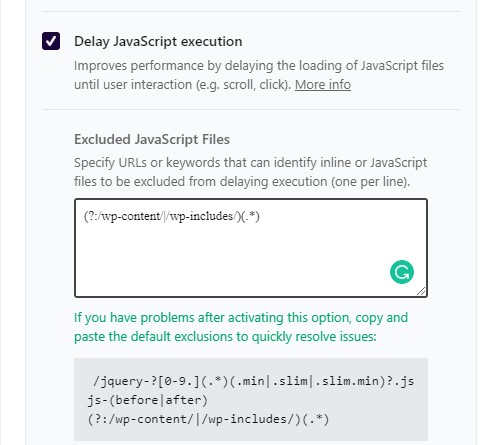
Note: If you are delay-rendering JavaScript, remove the JS file named responsive-menu; this will allow the menu to load and function on time if the visitor needs it.
The above JS issue is common with WP Rocket 3.9.* users, and if removing responsive-menu.min.js doesn’t work, then opt to allow all the JS inside the wp-content and wp-includes by using:
(?:/wp-content/|/wp-includes/)(.*)
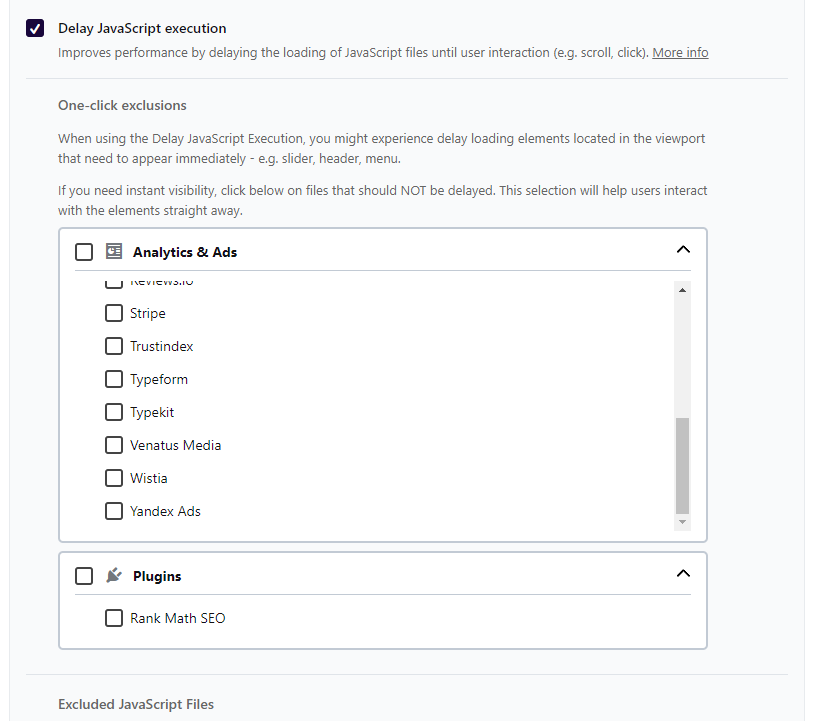
WP Rocket’s template bypasses known plugins & themes
WP Rocket now also supports bypassing the menu script (Including many themes and plugins) from the file optimization settings under WP Rocket > File Optimization > Javascript Files > Delay Javascript execution > Plugins

I hope that helped; if not, then do share the link in the comment or contact @wpgtr

Hi Saurabh,
I was hopeful when seeing your article. I have tried your suggestions, but unfortunately not working. I am using Genesis Parallax Pro – do you have any other thoughts for this child theme? Thanks much,
Rich
Hi there,
Sorry I missed out on your comment, I didn’t think that it would come up on search.
Is it sorted now?